A practical, research-backed reflection on why dashboards that are technically correct can still lead organizations in the wrong direction.
There is a strange moment that happens in many dashboard reviews.
The report opens. The numbers load. The refresh date looks good. The filters work. The KPIs are green.
And yet the business is not doing well.
Revenue is down. Growth is flat. Customers are leaving. Teams are arguing about priorities. Decisions still happen outside the dashboard.
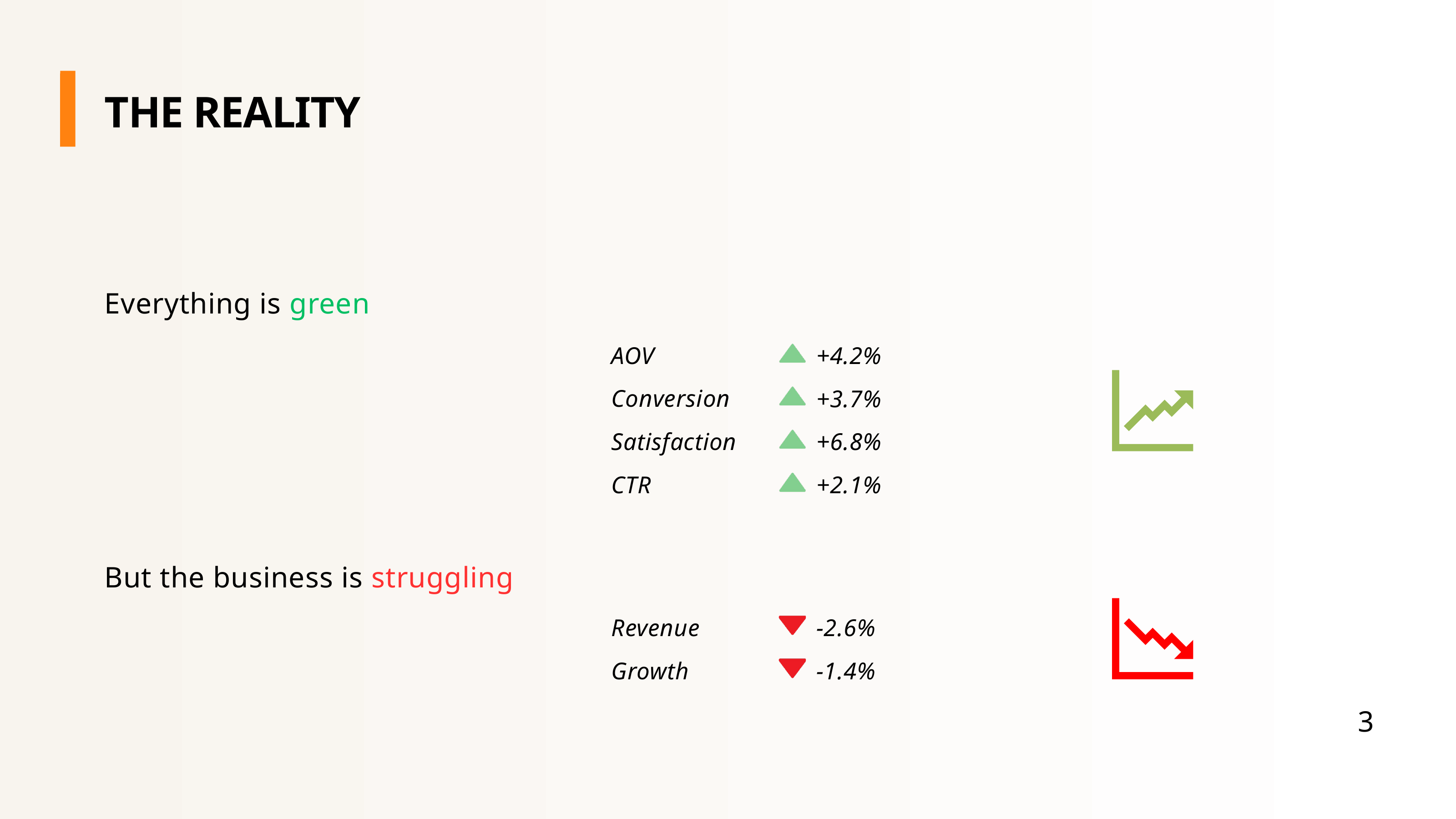
This is the uncomfortable part of analytics that we do not discuss often enough: a dashboard can be accurate and still be harmful. The data can be correct, the measures can be validated, the visuals can be clean, and the whole thing can still push people toward bad decisions.
That is what I call the KPI trap.
The KPI trap is not about broken data. It is about broken measurement logic. It happens when the metric is technically correct, but incomplete, badly framed, over-incentivized, or interpreted without enough context. And because KPIs look objective, we often trust them too quickly.
Dashboards promise clarity, but they also shape reality
Dashboards are built with good intentions. We want to enable data-driven decisions. We want transparency. We want alignment. We want everyone looking at the same version of performance instead of arguing from anecdotes. That promise is real. I still believe in it.
But dashboards do not just measure performance. They also shape attention. They tell people what matters, what should be discussed, what should be rewarded, and what can be ignored.
The moment a KPI appears on an executive dashboard, it becomes more than a number. It becomes a signal.
Aggregation illusion
The first trap is the aggregation illusion: the overall KPI improves, while every important segment tells a different story. This is the dashboard version of Simpson's paradox.
A famous example comes from the 1975 Science paper on graduate admissions at Berkeley. At the aggregate level, the data appeared to show a lower acceptance rate for women than men. But when the data was examined by department, the interpretation changed substantially — women had applied more often to highly competitive departments.[1]
The top-line number was not "wrong." It was incomplete. Business dashboards suffer from the same issue all the time.
The danger is simple: executives love the top line, but the top line often lies by omission. A good dashboard should allow the user to move from overall performance to segment-level explanation quickly. If the top-level KPI cannot be decomposed by market, product, channel, cohort, or customer type, then it may be useful for reporting but weak for decision-making.
Mix shift illusion
The second trap is the mix shift illusion. This happens when the KPI improves, but the underlying composition changes in a harmful way.
Imagine conversion rate is up. That sounds good. But then you look closer and realize that the growth came from low-margin products, heavy discounts, or customers who are unlikely to return. The KPI improved, but the business did not.
Michael Mauboussin's work on skill, luck, and performance interpretation is useful here — especially the idea that outcomes need to be decomposed before we draw conclusions from them.[2]
A dashboard should not only answer "Did the KPI move?" It should also help answer: what changed underneath it? Which segments contributed? Was the change profitable? Was it repeatable? Did we get better, or did the mix just change? Sometimes the most dangerous dashboard is the one that gives you a positive number with no explanation.
The lagging indicator illusion
Many dashboards are rear-view mirrors sold as steering wheels.
Revenue is down. Churn is up. Satisfaction has dropped. Important? Absolutely. Useful? Sometimes too late. Lagging indicators tell us what has already happened. They are essential for accountability, but weak for prevention. If the dashboard flags churn only after customers are gone, the business can explain the problem — but it cannot prevent it.
This does not mean we should remove lagging indicators. It means we should pair them with leading indicators. Churn should be paired with product usage, support friction, complaint patterns, or declining engagement. A dashboard that only shows outcomes may be good for reporting the past. A dashboard that combines outcomes with drivers is much better for managing the future.
Metric surrogation
A KPI often starts as a proxy. Customer satisfaction is a proxy for loyalty. Leads are a proxy for future pipeline. Utilization is a proxy for productivity. At the beginning, the proxy is useful. But over time, people start treating the proxy as the goal.
This is metric surrogation. The classic warning is Goodhart's Law: when a measure becomes a target, it stops being a good measure. Jerry Z. Muller discusses this problem extensively in The Tyranny of Metrics, where he describes how measurement can distort the very activity it is meant to improve.[3]
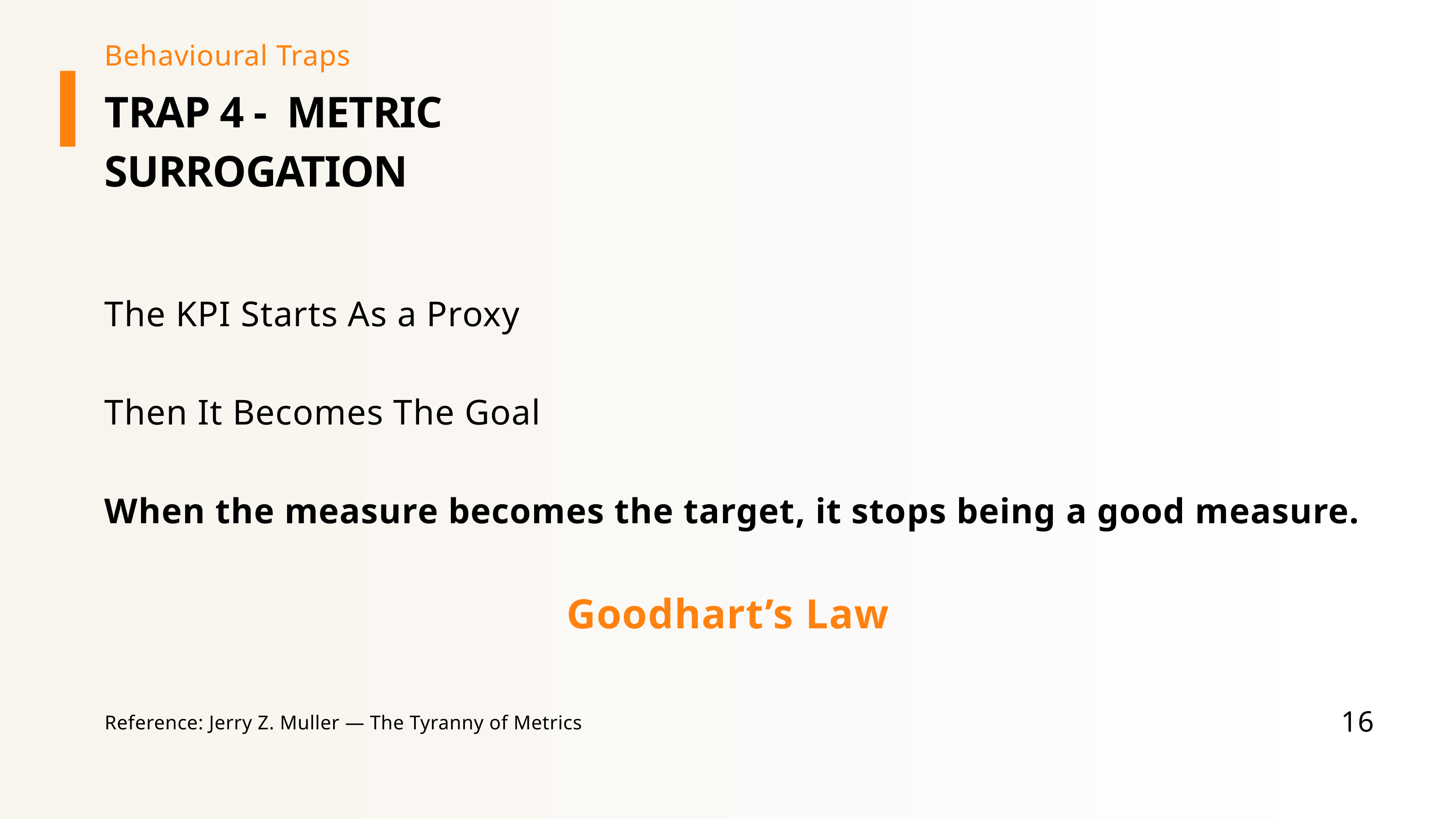
A support team measured on satisfaction scores may start optimizing the survey process instead of the customer experience. A marketing team measured on leads may increase volume while lowering quality. The KPI improves. Reality may not. Every KPI should be connected back to the real outcome it is supposed to represent.
The Cobra Effect
The Cobra Effect is what happens when incentives produce the opposite of what was intended. In dashboard form, it often looks like this: a call center is measured on average resolution time. So agents close tickets faster. They avoid harder cases. They discourage reopening. They prioritize speed over quality. The KPI improves. Customers become more frustrated.
Steven Levitt and Stephen Dubner popularized these kinds of incentive problems in Freakonomics, showing how people respond creatively — and sometimes destructively — to the incentives placed in front of them.[4]
If a KPI is important enough to reward or punish, it is important enough to stress-test for gaming.
Outcome bias
The outcome was good, so we assume the decision was good. The outcome was bad, so we assume the decision was bad. But reality is not that clean. A weak decision process can produce a good result because of timing, luck, or competitor mistakes. A strong decision process can produce a bad result because of uncertainty or unforeseen events.
Annie Duke explains this beautifully in Thinking in Bets: we should separate decision quality from outcome quality, because outcomes are often influenced by incomplete information and luck.[5]
If a rushed market launch succeeds, leadership may learn the wrong lesson: "Great decision, repeat it." To avoid outcome bias, dashboards should sometimes include decision context — what assumptions were made, what risks were known, what alternatives were considered, what confidence level existed.
Narrative fallacy
Humans love stories. Dashboards show patterns. Humans turn patterns into explanations. Sales increased after the campaign launched, so the campaign caused the growth. Two lines move together, so one must explain the other. Sometimes that is true. Often it is not.
Nassim Nicholas Taleb calls this tendency the narrative fallacy: our habit of creating coherent stories after the fact, especially when reality is more random or complex than we want to admit.[6]
Dashboards do not lie, but they invite us to. They reveal patterns. They do not automatically prove causes. A responsible dashboard should make room for alternative explanations — seasonality, pricing, channel mix, competitor activity, market trend — before drawing conclusions about causality. Confidence is not causality.
Local optimization
Each team hits its KPI. The system still underperforms.
Marketing is measured on lead volume. Sales is measured on conversion. Operations is measured on cost efficiency. Every team can show a green KPI while the customer experience and business growth suffer. This is local optimization.
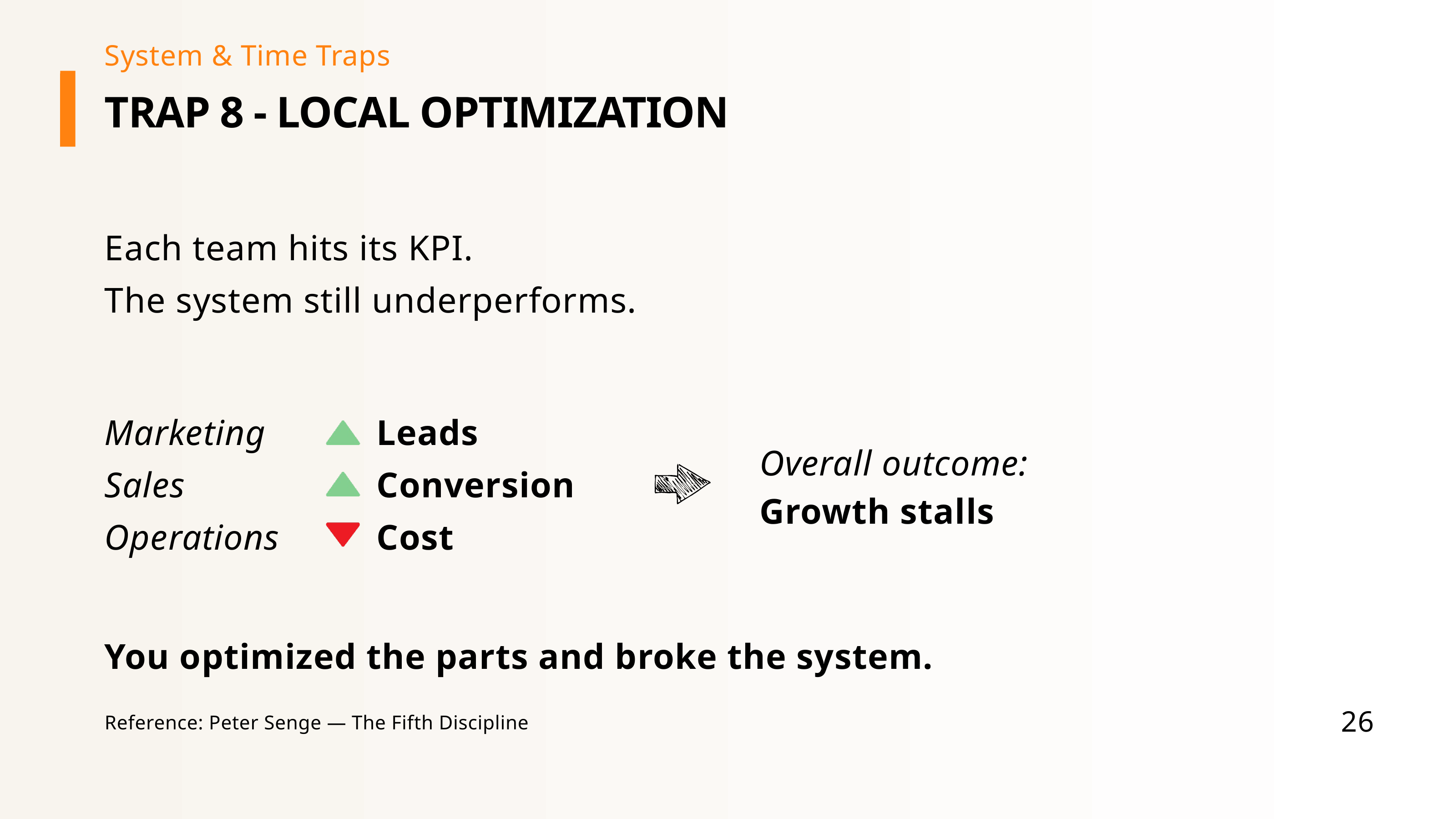
Peter Senge's The Fifth Discipline is useful here because it encourages us to see organizations as systems rather than isolated parts.[7] A better executive dashboard should include system-level metrics: customer lifetime value, end-to-end conversion, onboarding quality, margin after service cost, or total value delivered. The question is not only whether each function is successful. The question is whether the system is working.
Short-term bias
This trap appears when the short-term KPI improves while the long-term outcome quietly deteriorates. Discount-driven revenue goes up. Margin quality goes down. Performance marketing looks efficient this month. Brand strength weakens over time. Costs are reduced this quarter. Capability is damaged for next year.
David Laibson's work on hyperbolic discounting shows how people tend to overweight immediate rewards compared with future benefits.[8] Mizik and Jacobson studied myopic management and its long-term performance consequences, showing how short-term financial pressure can push firms toward decisions that hurt future value.[9] Les Binet and Peter Field's research warns against over-reliance on short-term metrics as primary measures of marketing success.[10]
What all nine traps share
All these traps look different, but they share the same underlying problem: the dashboard is not wrong. The measurement logic is incomplete.
This is why dashboards should not be designed only around available data. They should be designed around decisions.
A practical KPI design checklist
Before a KPI goes onto an executive dashboard, I ask four questions.
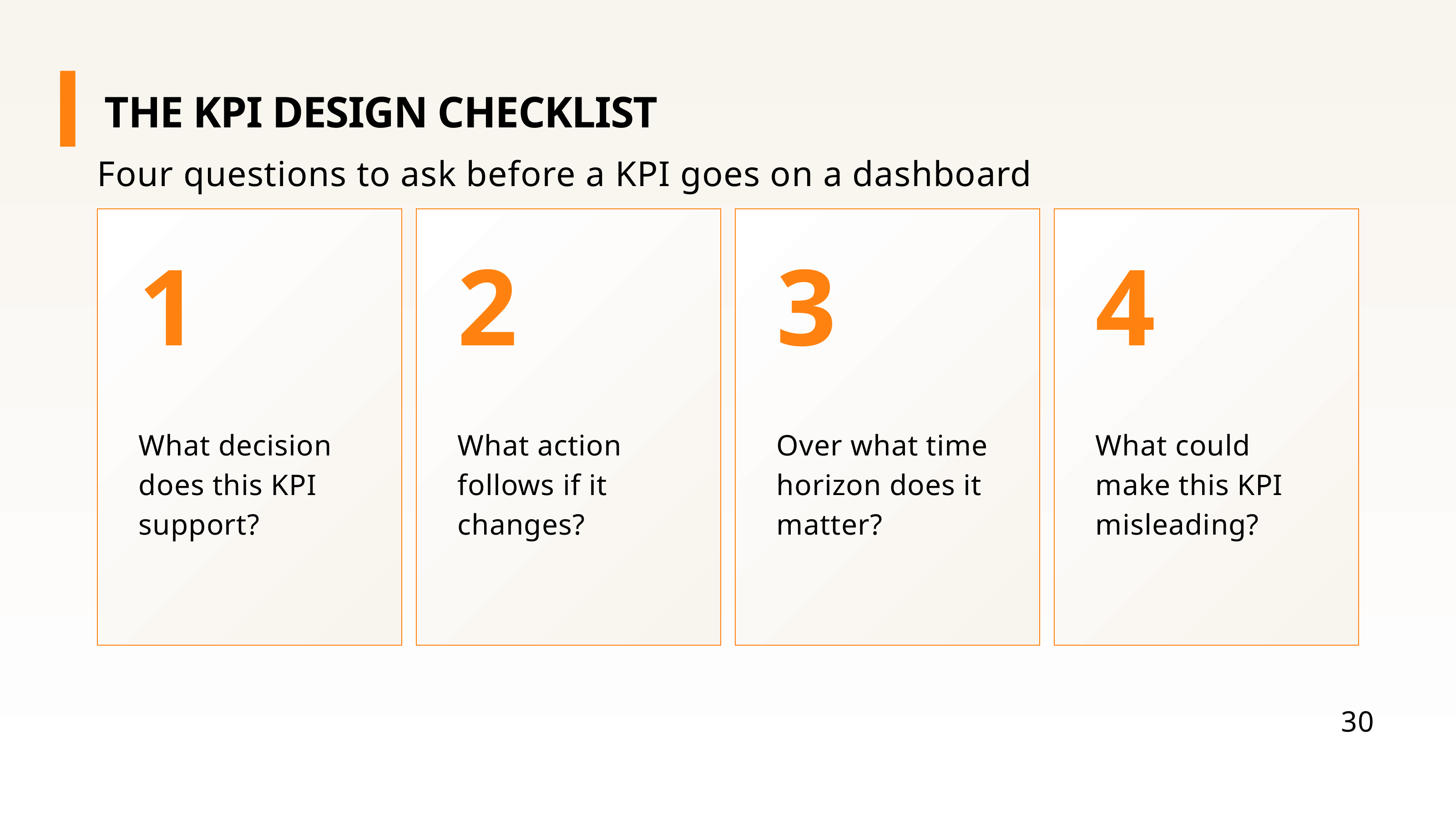
1. What decision does this KPI support?
If a KPI does not help someone choose, prioritize, or act, it may be interesting — but it is probably not decision-grade. A dashboard is not a museum for numbers.
2. What action follows if it changes?
If the number moves and nobody knows what to do next, the organization is observing, not managing. A useful KPI should have a possible response attached to it.
3. Over what time horizon does it matter?
Some KPIs matter daily. Others matter weekly, monthly, quarterly, or over several years. A lot of reporting mistakes happen because we use the right KPI at the wrong rhythm.
4. What could make this KPI misleading?
Could aggregation hide the truth? Could incentives distort behavior? Could the mix change? Could a short-term gain create long-term damage? Could the metric be gamed? The most dangerous KPIs are often not wrong. They are incomplete.
Designing better executive dashboards
If we take the KPI trap seriously, executive dashboards should become simpler, not more complex. Fewer KPIs. Clearer priorities. Better context. More balance between leading and lagging indicators. More attention to systems and time horizons.
A better dashboard does not try to answer every possible question on one page. It helps the audience focus on the right questions. Not only what happened — but also:
That last question is especially important. Because dashboards are not passive. They shape behavior, attention, and decisions.
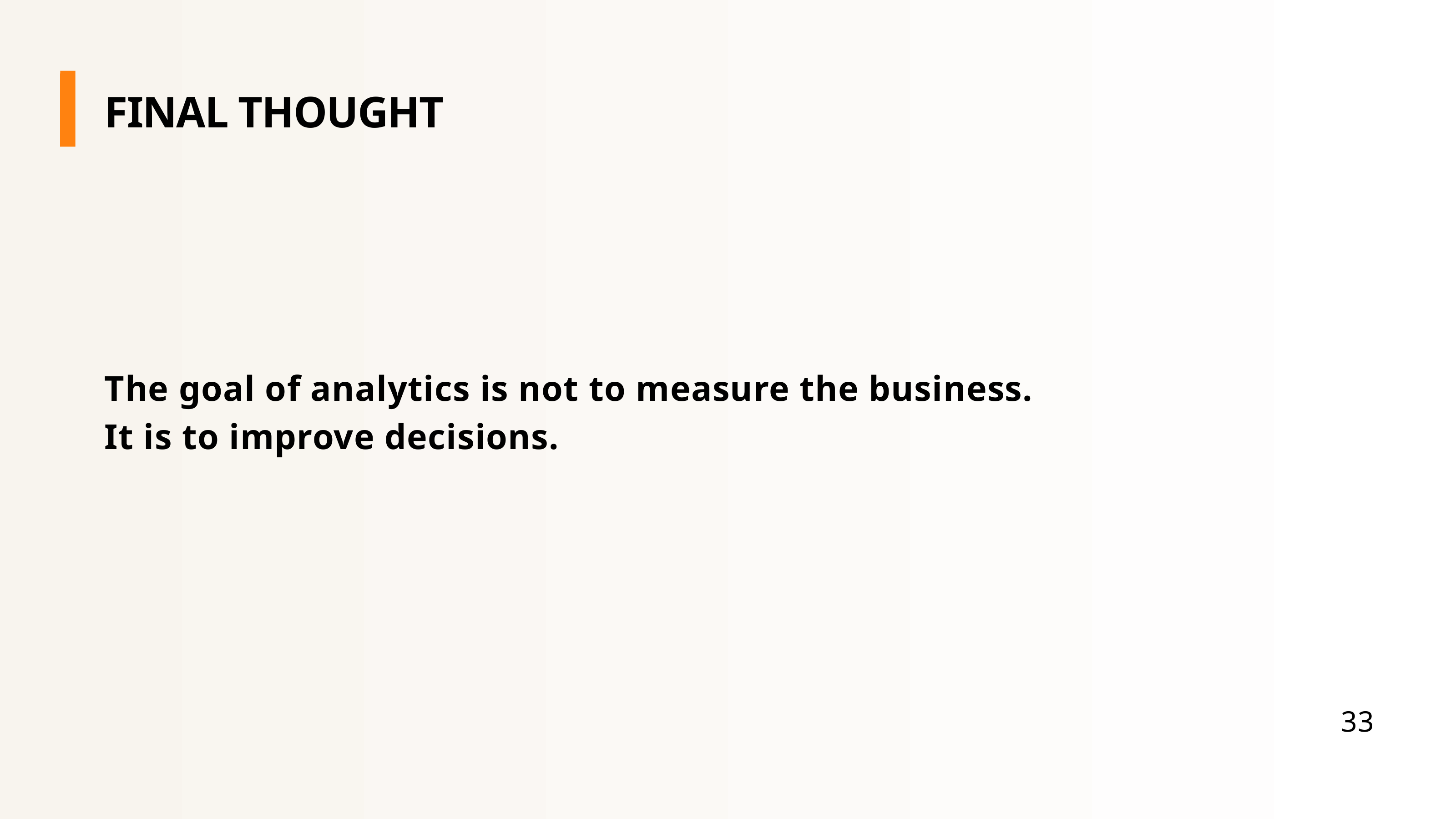
That is the line I keep coming back to.
The real question is: does this help the organization make better decisions? If yes, the dashboard is doing its job. If not, then even a green KPI can be a warning sign.